Jalen Brunson Defensism Data Analysis


The purpose of this page is to help people researching or seeking data-driven insights into Jalen Brunson’s defensive performance by using advanced basketball analytics and visualizations. By examining multiple defensive metrics and charts, the page provides context on Brunson’s defensive strengths, weaknesses, and overall impact, allowing readers to better understand how his defensive activity compares to league averages and how it influences team performance.
Bio
Jalen Brunson is an American professional basketbal player fo the New York Knicks. He is recognized as one of NBA’s top point guards is his team’s leading scorer, averaging around 28.2 points per game, higher than most of his teammates. However his defensive rating is around 120-121 which is worse than other league average defenders.
 Source:
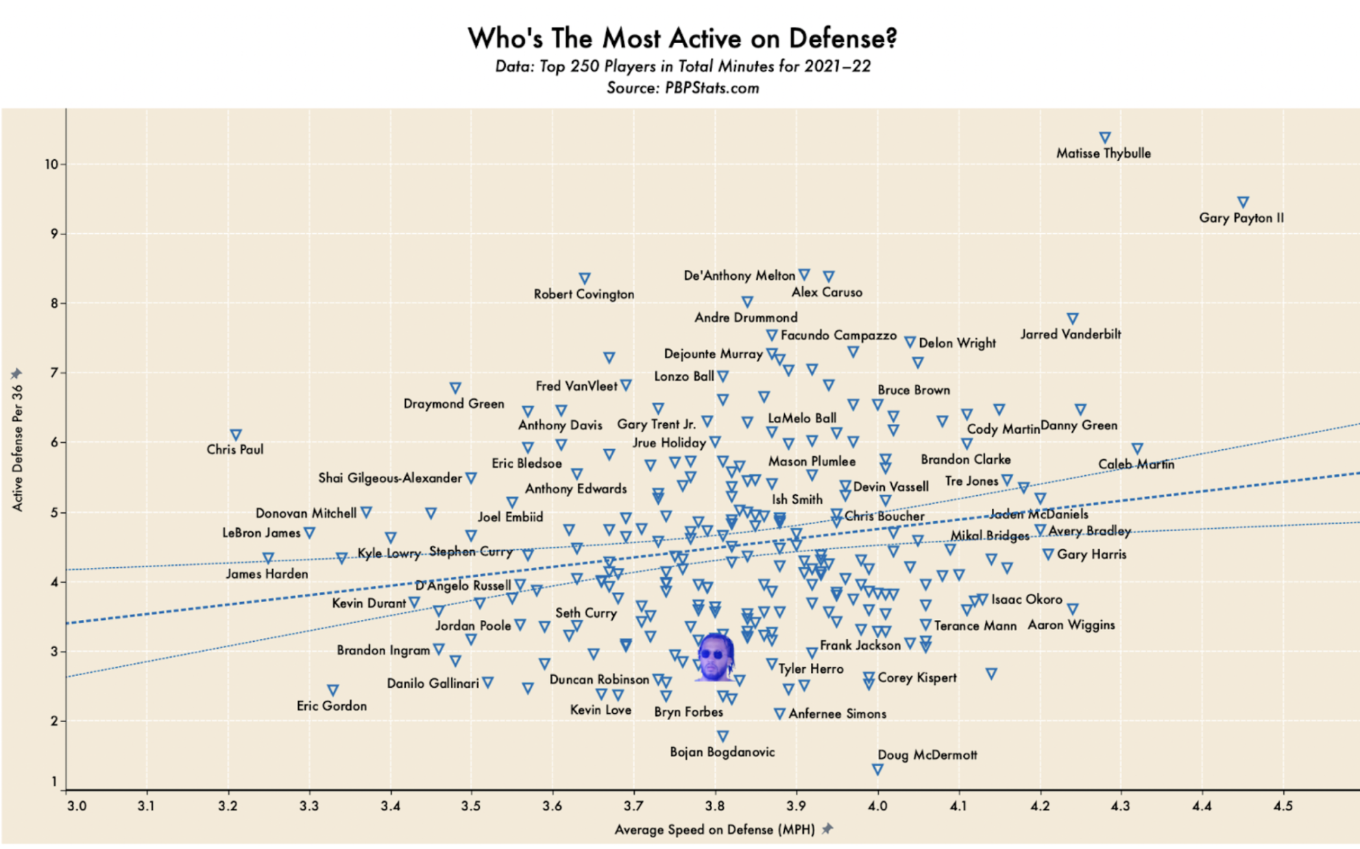
 Average Speed of Defense
Figure 1.1 • This graph shows Brunson’s active defense by comparing Average Speed on Defense, which is how fast a certain player moves while defending, which draws from tracking data, against Active Defense per 36 minutes, a composite metric that includes actions like loseouts, contests, deflections, and rotations. Based on these metrics, this graph shows that the higher the placement, the more defensive activity, and the more right the placement, the faster the player. Generally, a top right placement shows more impactful defenders and a bottom left placement shows weaker defenders. This graph does not directly show the quality of the players, but more so the activity. Brunson is highlighted near the lower middle area of the graph. This point tells us that he has below-average speed and moderate defensive activity. This graph visually shows that Brunson is not a very strong defender. Data shows poor containment impact, so Brunson should rarely guard the fastest or strongest opposing players or large areas on the court.
This data visualization is decently clear, with good, helpful details like trendlines and name labels for individual players. I also like that the Y-axis starts at 3.0 as opposed to 0 to spread out the data for better visual understanding. I think this visual could benefit from more color distinctions, such as using red and green to signify positive and negative reflections in the data.
 Source:
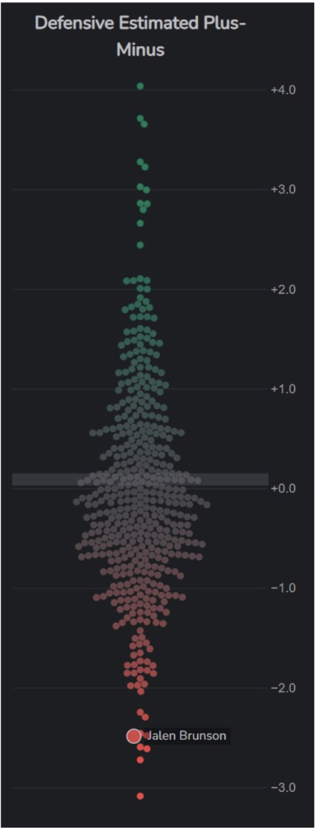
 Defensive Estimated Plus-Minus
Figure 1.2 • This graph shows Defensive Estimated Plus-Minus (D-EPM), which estimates how many points per 100 possessions a player adds or costs their team while on defense. A positive data point shows improvement in team defense, and a negative is improvement in the team defense. Each dot is an NBA player, and the vertical position is their defensive value. The 0.0 line is the league average. Brunson sits near the very bottom at around -2.5 D-EPM, well below average, with a negative impact on his team. This shows that when Brunson is on the court, the Knicks ’ defense allows ~2.5 more points per 100 possessions than average. Since most players are between 0 and 0.75, Brunson’s placement being well outside of that range is a negative reflection on his value as a player. Again, this data confirms that Brunson is not a strong defender and does not place Brunson as a defender against a strong opponent.
This data visualization could be improved by offering more interaction and customizable data visualizations to show how Brunson’s defensive impact could change by lineup partner.
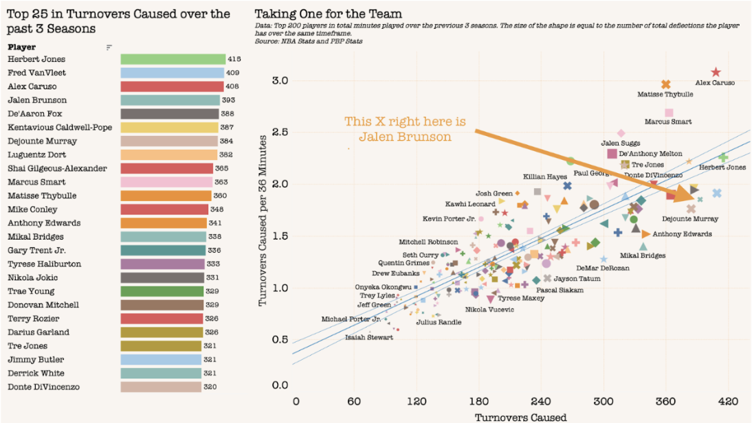
Defensive Turnovers
Figure 1.3 • This graph visualizes turnovers in the context of a defensive statistic. This is turnovers “caused” referring to defensive actions such as steals, charges drawn, and deflections that directly caused such turnovers. The left panel shows raw cumulative turnovers forced, and Brunson falls 4th overall among all players. The right panel shows turnover caused per 36 minutes, creating a metric that sets a better context for a player’s defensive skill. Brunson is at about 2.2 turnovers per 36 minutes, showing that he is excellent at forcing turnovers and is an active defender in this context. This data shows that Brunson still has skill and value as a defender and that action needs to be taken to improve his defensive aggression through coaching defense activity better. Brunson could serve as an ideal player when attacking and forcing turnovers.
This visualization offers nice distinctions in terms of colors and shapes in distinguishing each player or data point. It also nicely varies the size of each data point, increasing in size for a better data reflection. Some improvements could include a better labeling system, as it is difficult to see which name associates with each data point.